- purply typograhpic
- type as image (type taking a form to replace the image)
- swiss style poster, mainly concentrating on type but shapes to represent image
After speaking about these ideas to other students in a small crit they said that challenging myself to create Swiss film poster would be interesting and possibly create some nice outcomes. From this feedback i decided to experiment with a few different posters to see if the Swiss style would create the desired look for a successful typographic film poster.


After creating these designs in a Swiss style i noticed that they didn't communicate a true reflection of what the film is about. The successful parts of this design were the colours as they are a good reflection of the film but not enough for the poster to be a good reflection of the film. From my research i have noticed that the typography on a poster is more of a typographic logo that is used again when there is sequel to films so it becomes the films identity. This makes the type more recognisable but it still over looked as the imagery is overpowering. This is why i have decided to experiment with using the already existing typographic logo for films and redesigning the poster with certain aspects of swiss design, such as 2d images that have limited detail and using bright relevant colours that are representative of the film, this will hopefully reflect the film successful along side the films typographic logo.
Sketches for poster designs inspired by swiss :


The films i choose to create posters for were, star wars the last jedi, men in black, big hero 6, the hit mans body guard, beauty and the best, captain america, cinderella, jaws, deadpan and back to the future. I choose these films as it is a good mix of animation, action, thriller and fairy tale so that i could cover most of the genres of films.


As a starting point i started to design a poster for men in black, because i had decided to do swiss inspired designs but not actual swiss design i found it difficult to decide how i should represent the men figures. The men figure in the left poster are slightly more traditional to the swiss style compared to the right poster. This was a difficult decision so i asked for feed back. The feedback which i received was in favour of the right poster as it is still symbolic of man, but has enough detail that it is interesting to look at but not too interesting that it takes away from the type, which is supposed to be the main focus.


Above is the design for beauty and the beast. I kept the original logo type from the original film poster but added a colour overlay to flatten the depth of the type that made it look shinny. I choose to make the type red as it is the same colour as the rose which plays a key part in the film, this was also appropriate when i added the stem of a rose under the logo. This was a reference to swiss style representation, as the logo represents a rose when na stem is added. The gold/orange background was used as a reference to the colour of bells dress in the film, this was a key link to the main character in the film. Without the simple reference to the rose this poster would not be as successful with just the gold background as the rose stem is eye catching and draws attention to the type.


Above is the design for Cinderella. Once again i kept the original logo type from the original film poster and again flattered the text by adding a gold/orange colour overlay, this represent the same effect while still being 2d and incepting with the swiss style influence. The choice of blue background was a reference to cinderella's dress in the film as well as the shoe. The 2d style of the shoe is similar to that of swiss but is more elegant as it looks more realistic than representational.
The use of flat 2d design in these posters really made the logo type really stand out and be the centre focus, along side 2d imagery that didn't take away from it but added to the representation of the film. After creating these designs and getting positive feedback i decided that it would contain with this style and make more of a range.


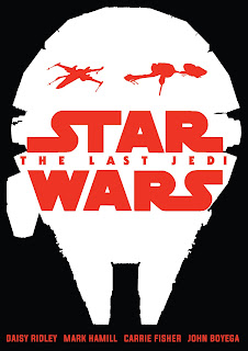
The most important design aspect of these posters was the appropriate use of colour along side the logo type as without it the representation of the film would be wrong and would make them unsuccessful film posters.
No comments:
Post a Comment