Monday, 18 December 2017
Practicals intended audience
The intended audience for my designs are film viewers, and art lovers as these are not official posters just representations of how type can work as the main focus and communication of film posters. This would mean that they are for art pieces to be put in anyones home for anyone of any age.
Sunday, 17 December 2017
Images to analyse in dissertation

Triboro were asked by Nike to create
an advertising campaign for Nike products to be launched in New York City, the
designs concept was simple but effective as they cleverly removed parts of the typography
in the classic Nike logo to change it to say NYC. This then created an iconic
look that was transferred to many different platforms such as taking out
stitching on already made Nike cap, advertising within sport events and many
art murals across the city. The design doesn’t change its
iconic look too much, as it’s still the same typeface, still the same logo but it
has been edited to read something different, that’s why it is successful
because it not only represents the brand, it represents the Nike brand within
the city of NYC. Although changing the typography
altered the logo, the iconic Nike tick symbol was still easily recognisable
with the brands iconic tick along side the new typography. The Nikes logo is
recognisable as it has been used for many years but not only that it is
successful because of its simplicity in design. Its simple design allows for it
to be used on any product at any size, in any colour, this helps to create an
overall simple yet effective brand recognition.

The second piece of design chosen was a poster
from Josef Muller Brockmann, the design is poster for a festival in Zurich
1959, this poster is purely typographic and it was created in a
classic Swiss design style. The Swiss design movement first emerged in the
1920’s but was really developed in Switzerland during the 1950’s, the movement
trademark styles incorporated geometric layouts that used grids, sans-serif
typefaces and the use of shapes instead of images. The poster utilises all the
key aspects of Swiss design to create a simple yet effective and legible piece
of communication. A clear use of a 5 column grid was used to layout and align
the supporting information with the festivals new spanning cross all five columns
to create emphasis and show its importance, the columns made the layout
successful as a type hierarchy was created within the us layout of type in the
grids columns. A use of two typefaces were successful as it helps emphasise the
posters type hierarchy and made the posters information more efficient to read,
and the use of only san-serif types was in keeping with the overall Swiss Aesthetic
design of the poster.

The third piece of design chosen was a piece by
Paula Scher, the piece of design is the Atlantic Theater Company brand identity. Paula was asked to create a design that would “Raise its
institutional profile and stand out in the city’s crowded arts landscape.” To start with Paula Scher created a typography
logo were the a’s counter in the name ‘Atlantic theater company’ were blocked
out creating a shape similar to that of a spotlight, this was appropriate as a
spotlight is a key feature in any theater production. The whole Identity is then
based around the shape taken from the spotlight shapes A in the typographic
logo and used across the theaters branding used on letter heads and other
official documents, and is used to be the base shape for promotional materials
linking all present and future promotional materials together, creating a
recognisable and successful branding identify.
Saturday, 16 December 2017
Development of practical
Film poster style ideas:
- purply typograhpic
- type as image (type taking a form to replace the image)
- swiss style poster, mainly concentrating on type but shapes to represent image
After speaking about these ideas to other students in a small crit they said that challenging myself to create Swiss film poster would be interesting and possibly create some nice outcomes. From this feedback i decided to experiment with a few different posters to see if the Swiss style would create the desired look for a successful typographic film poster.


After creating these designs in a Swiss style i noticed that they didn't communicate a true reflection of what the film is about. The successful parts of this design were the colours as they are a good reflection of the film but not enough for the poster to be a good reflection of the film. From my research i have noticed that the typography on a poster is more of a typographic logo that is used again when there is sequel to films so it becomes the films identity. This makes the type more recognisable but it still over looked as the imagery is overpowering. This is why i have decided to experiment with using the already existing typographic logo for films and redesigning the poster with certain aspects of swiss design, such as 2d images that have limited detail and using bright relevant colours that are representative of the film, this will hopefully reflect the film successful along side the films typographic logo.
Sketches for poster designs inspired by swiss :


These sketches helped me figure out wether or not the swiss inspired look would be more effective, from feedback received it was clear that the poster communicated more with a more detailed shape what wasn't represented by the harsh shapes that swiss style uses to represent the image. this gave the poster a more welcoming feel which would create a lasting impression. It also complemented the logo type without taking away from it, but instead adding to its communication.
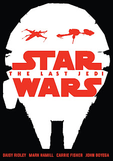
The films i choose to create posters for were, star wars the last jedi, men in black, big hero 6, the hit mans body guard, beauty and the best, captain america, cinderella, jaws, deadpan and back to the future. I choose these films as it is a good mix of animation, action, thriller and fairy tale so that i could cover most of the genres of films.
After the sketches i took one of each design and started to work them up on photoshop.


Above is the design for beauty and the beast. I kept the original logo type from the original film poster but added a colour overlay to flatten the depth of the type that made it look shinny. I choose to make the type red as it is the same colour as the rose which plays a key part in the film, this was also appropriate when i added the stem of a rose under the logo. This was a reference to swiss style representation, as the logo represents a rose when na stem is added. The gold/orange background was used as a reference to the colour of bells dress in the film, this was a key link to the main character in the film. Without the simple reference to the rose this poster would not be as successful with just the gold background as the rose stem is eye catching and draws attention to the type.


The most important design aspect of these posters was the appropriate use of colour along side the logo type as without it the representation of the film would be wrong and would make them unsuccessful film posters.
- purply typograhpic
- type as image (type taking a form to replace the image)
- swiss style poster, mainly concentrating on type but shapes to represent image
After speaking about these ideas to other students in a small crit they said that challenging myself to create Swiss film poster would be interesting and possibly create some nice outcomes. From this feedback i decided to experiment with a few different posters to see if the Swiss style would create the desired look for a successful typographic film poster.


After creating these designs in a Swiss style i noticed that they didn't communicate a true reflection of what the film is about. The successful parts of this design were the colours as they are a good reflection of the film but not enough for the poster to be a good reflection of the film. From my research i have noticed that the typography on a poster is more of a typographic logo that is used again when there is sequel to films so it becomes the films identity. This makes the type more recognisable but it still over looked as the imagery is overpowering. This is why i have decided to experiment with using the already existing typographic logo for films and redesigning the poster with certain aspects of swiss design, such as 2d images that have limited detail and using bright relevant colours that are representative of the film, this will hopefully reflect the film successful along side the films typographic logo.
Sketches for poster designs inspired by swiss :


The films i choose to create posters for were, star wars the last jedi, men in black, big hero 6, the hit mans body guard, beauty and the best, captain america, cinderella, jaws, deadpan and back to the future. I choose these films as it is a good mix of animation, action, thriller and fairy tale so that i could cover most of the genres of films.


As a starting point i started to design a poster for men in black, because i had decided to do swiss inspired designs but not actual swiss design i found it difficult to decide how i should represent the men figures. The men figure in the left poster are slightly more traditional to the swiss style compared to the right poster. This was a difficult decision so i asked for feed back. The feedback which i received was in favour of the right poster as it is still symbolic of man, but has enough detail that it is interesting to look at but not too interesting that it takes away from the type, which is supposed to be the main focus.


Above is the design for beauty and the beast. I kept the original logo type from the original film poster but added a colour overlay to flatten the depth of the type that made it look shinny. I choose to make the type red as it is the same colour as the rose which plays a key part in the film, this was also appropriate when i added the stem of a rose under the logo. This was a reference to swiss style representation, as the logo represents a rose when na stem is added. The gold/orange background was used as a reference to the colour of bells dress in the film, this was a key link to the main character in the film. Without the simple reference to the rose this poster would not be as successful with just the gold background as the rose stem is eye catching and draws attention to the type.


Above is the design for Cinderella. Once again i kept the original logo type from the original film poster and again flattered the text by adding a gold/orange colour overlay, this represent the same effect while still being 2d and incepting with the swiss style influence. The choice of blue background was a reference to cinderella's dress in the film as well as the shoe. The 2d style of the shoe is similar to that of swiss but is more elegant as it looks more realistic than representational.
The use of flat 2d design in these posters really made the logo type really stand out and be the centre focus, along side 2d imagery that didn't take away from it but added to the representation of the film. After creating these designs and getting positive feedback i decided that it would contain with this style and make more of a range.


The most important design aspect of these posters was the appropriate use of colour along side the logo type as without it the representation of the film would be wrong and would make them unsuccessful film posters.
Subscribe to:
Comments (Atom)